

Phew.
It's done. It isn't perfect - there are so many things I'd like to tweak (the link colours won't match each other for starters)...but for now, it's done. I need to walk away and revisit it later I think. It's here.
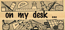
Now then. My new dotcom banner. There is talk in this house of it resembling a sandwich shop. Apparently, it doesn't really know what it's saying - mainly because of the tiny glimpses of product...you can't tell at a glance what they are, exactly. Point taken, but I think I quite like it. I'm going to let it sit for a while and wash over me.
I've told the woodcutter that I can take criticism rather well (ahem), so I'm open to your thoughts....


9 comments:
hi charlotte :)
i've just sat and watched the slideshow of your pieces, they look fantastic!
i like the pics on the new banner, i just think the colour behind the text looks a little starbucks or costa coffee... when i think of you and your work i think of bright, cheery and vivid colours... maybe a brighter red like the second pic?
hope this is helpful :)
emma
x
Thanks, Emma - yep, I saw the starbucks in there too!! Glad the slideshow worked well.
Bright and cheery? You might be right...
Hi Charlotte,
I think it would be great to see more of your beautiful jewellery.
Looks good Charlotte - you'll probably find you keep tweaking it until you're happy with it!
What a lovely website..the words especially.
Charlotte your website is very beautiful!
Oh, its pretty!
Hi Charlotte,
I think the pictures and information are perfect. I agree that the banner is a little like a coffee shop company. If the pictures in the banner were more colourful it would show of your wonderful work instantly.
I just had a look.It's brilliant!A perfect showcase for your work!Your photos are stunning and show all the amazing details which make your pieces so unique.
May be the closeness of the colours and tones in the details on the right hand side makes them less easy to read but the colour of the banner is very sophisticated.I think it goes well with your work.
Post a Comment